Design Brief
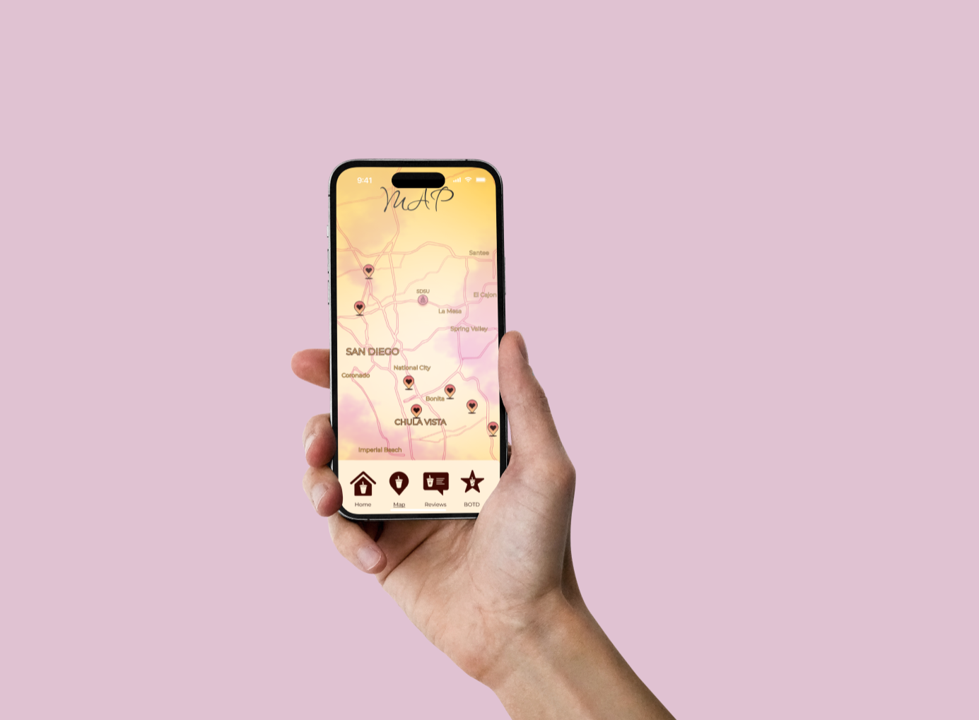
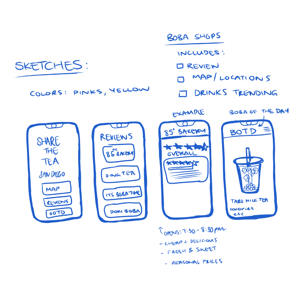
For this project, the goal was to create a navigation guide in the form of a mobile app to encourage local tourists and/or residents to explore the area. The features of the app needed to include a map, reviews, and a unique user-flow. The process to design this app involved sketching, researching the area, creating personas, building wireframes, and undergoing various tests on the prototype.
sketches
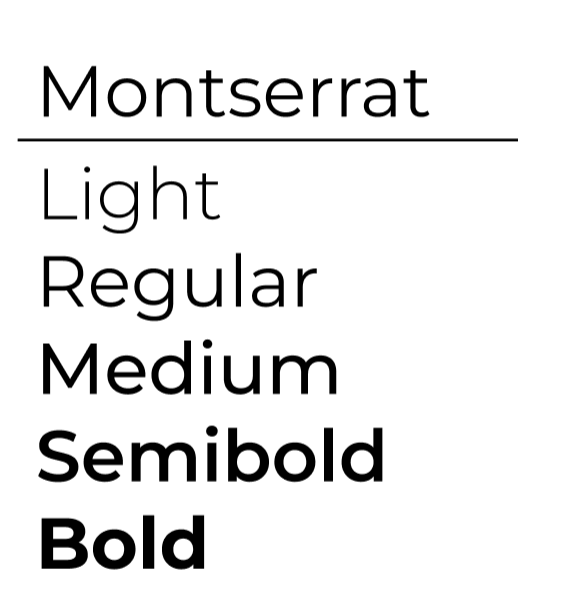
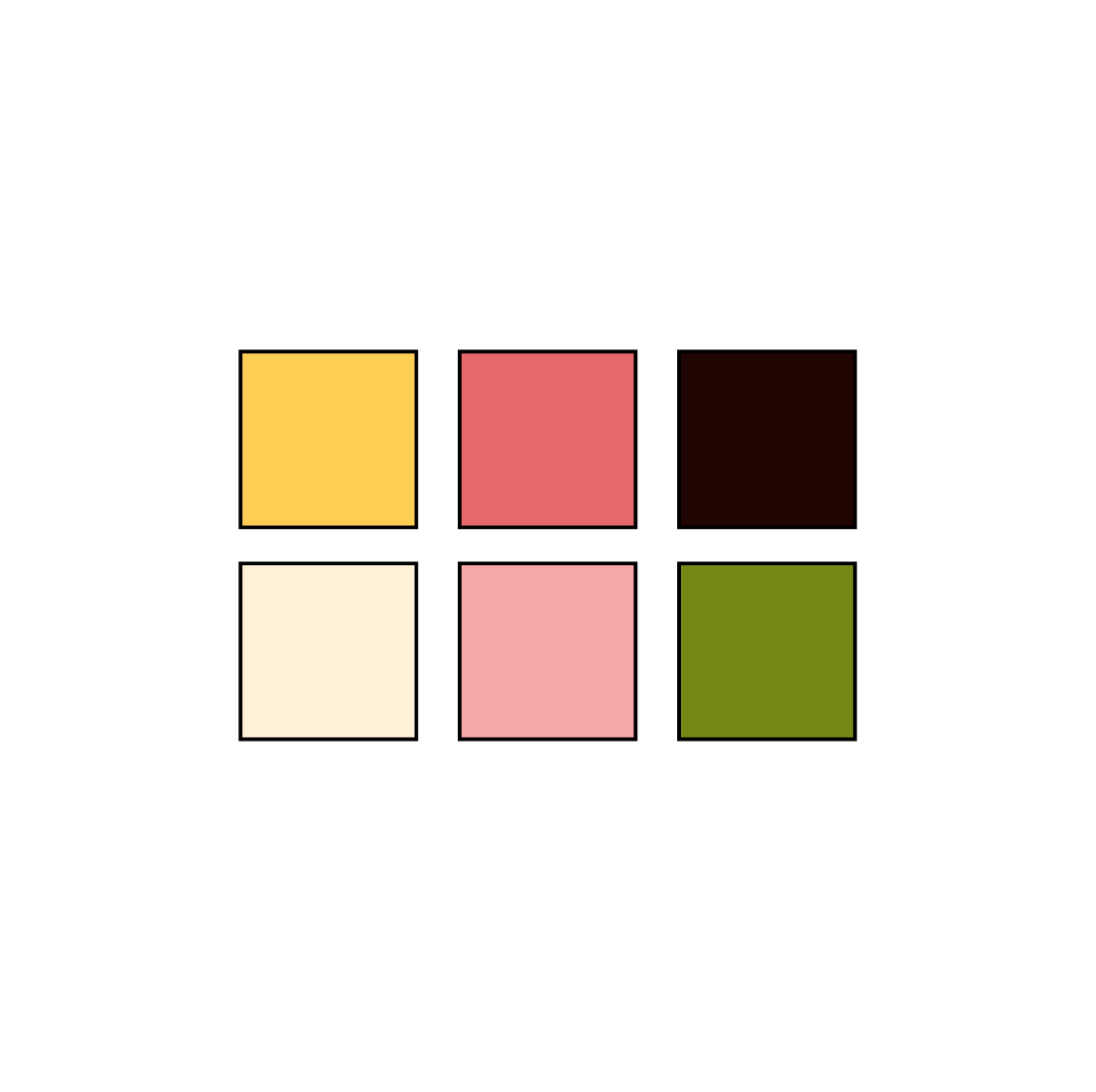
Typeface & Color Palette
Personas
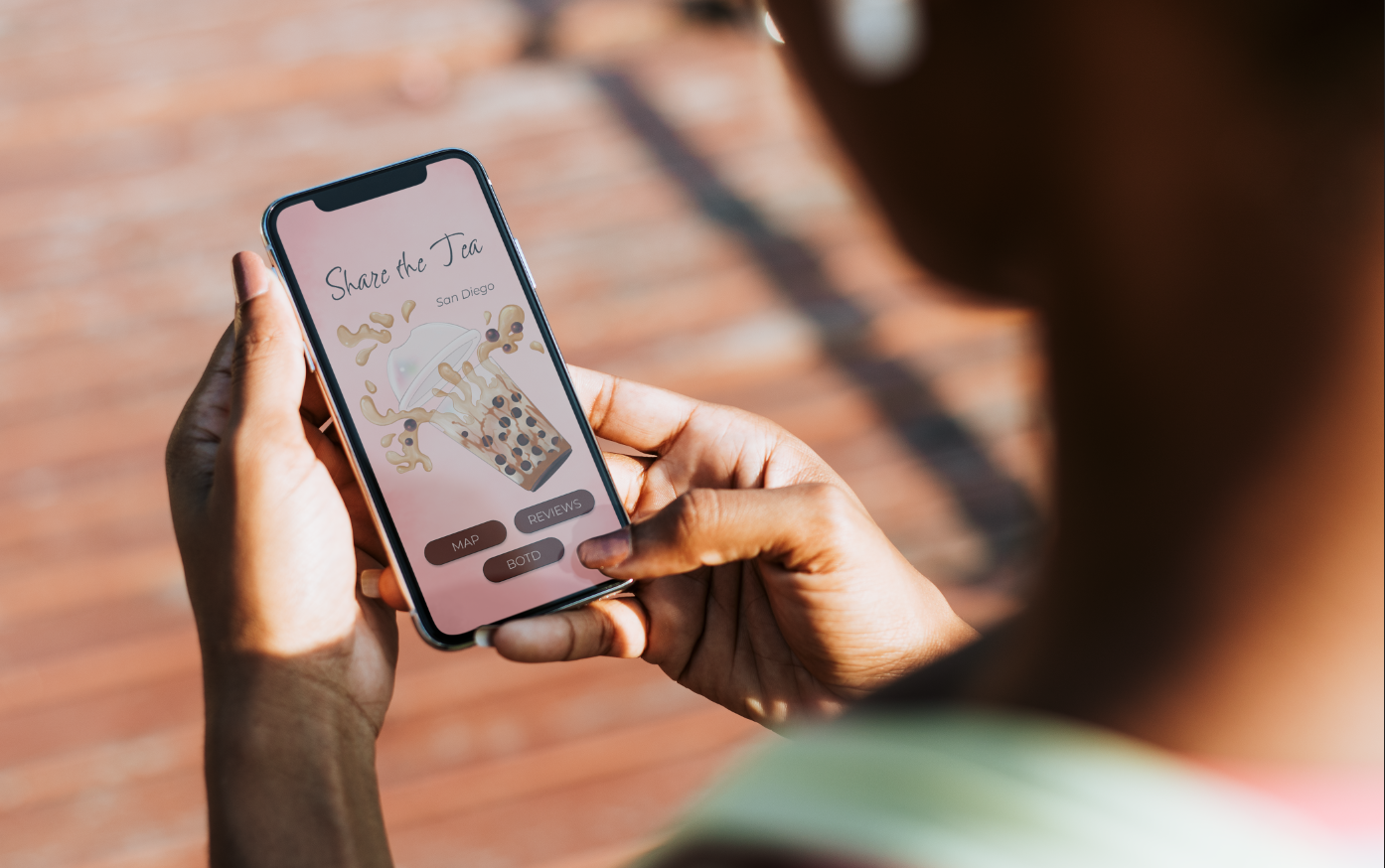
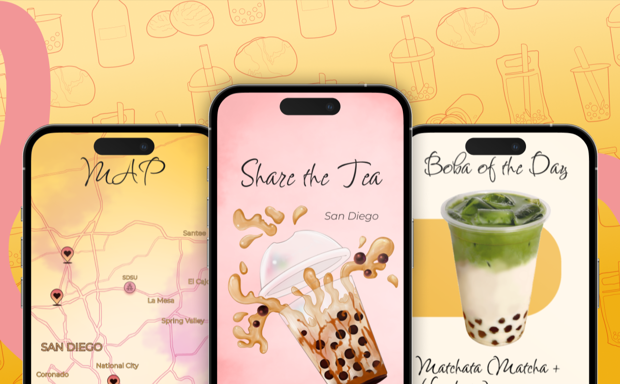
The app's main focus is on finding the best boba shops around San Diego. My personas for the app were a young adult and an elderly woman (both college graduates) who are huge boba enthusiasts. The main color palette was intended to have warm, fuzzy color tones like pink and yellow. The unique user-flow I added was a "Boba of the Day" feature to promote different drinks for customers to try. This not only encourages people to try new drinks, but to go to different locations that buy the drink.
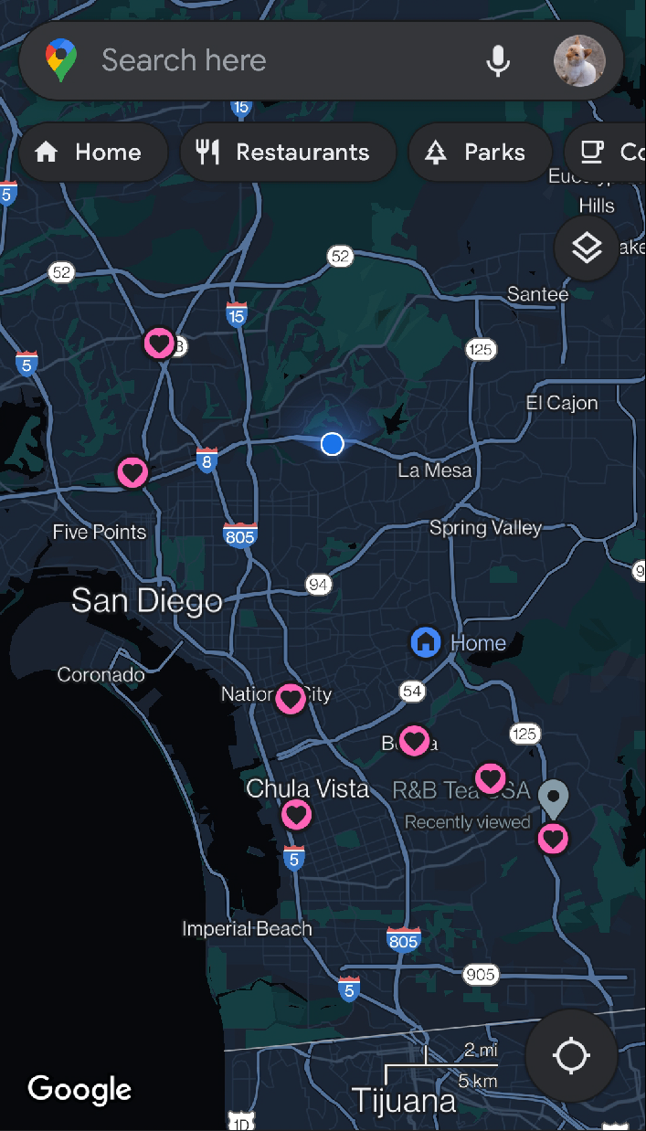
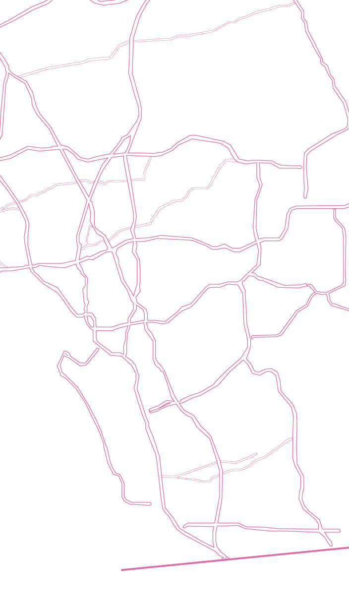
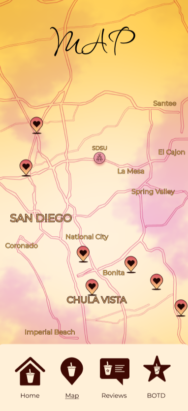
Map
1. Screenshot pinned boba shops in San Diego
2. Trace out map on Adobe Illustrator
3. Create background (FireAlpaca)
4. Put together designs on Figma

Icons
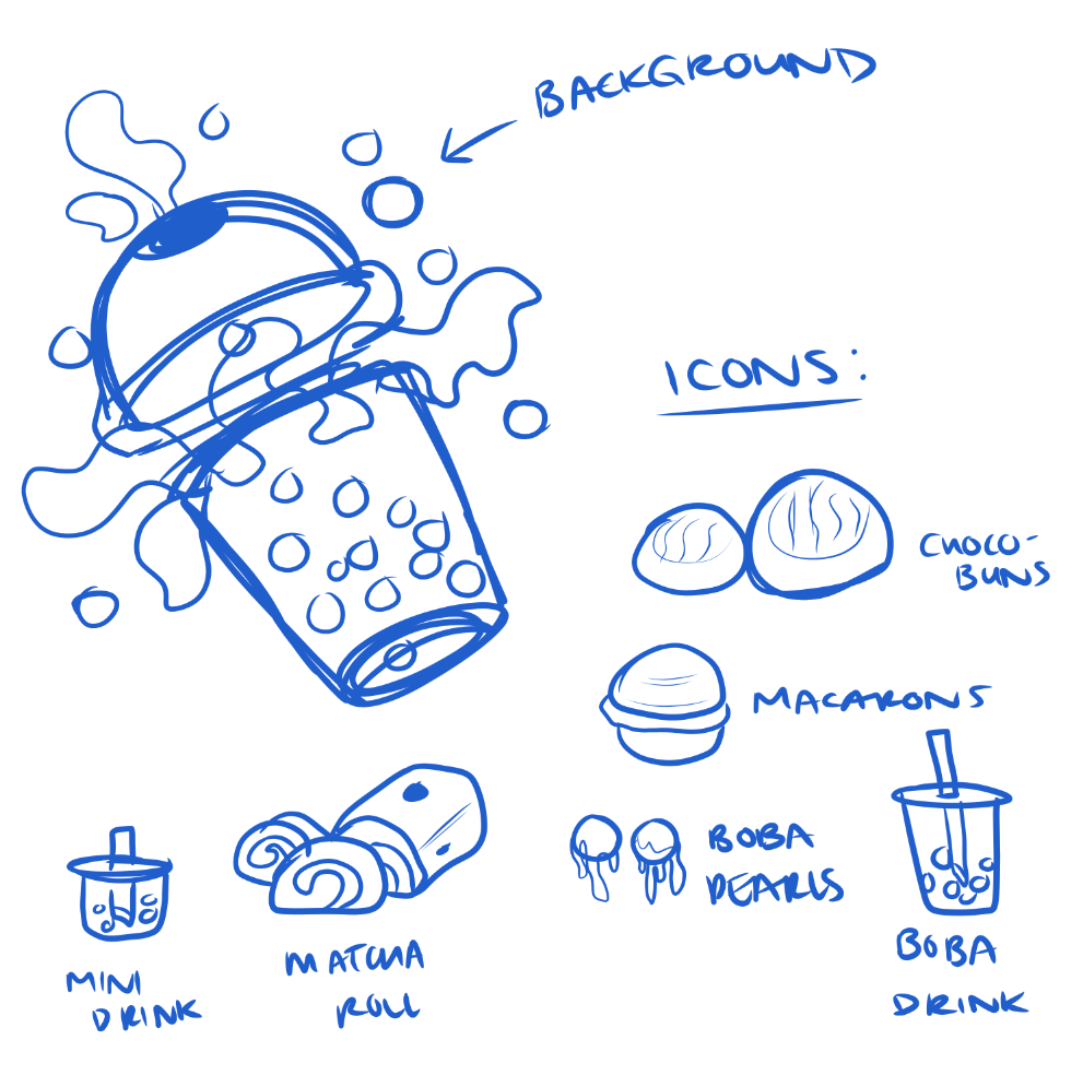
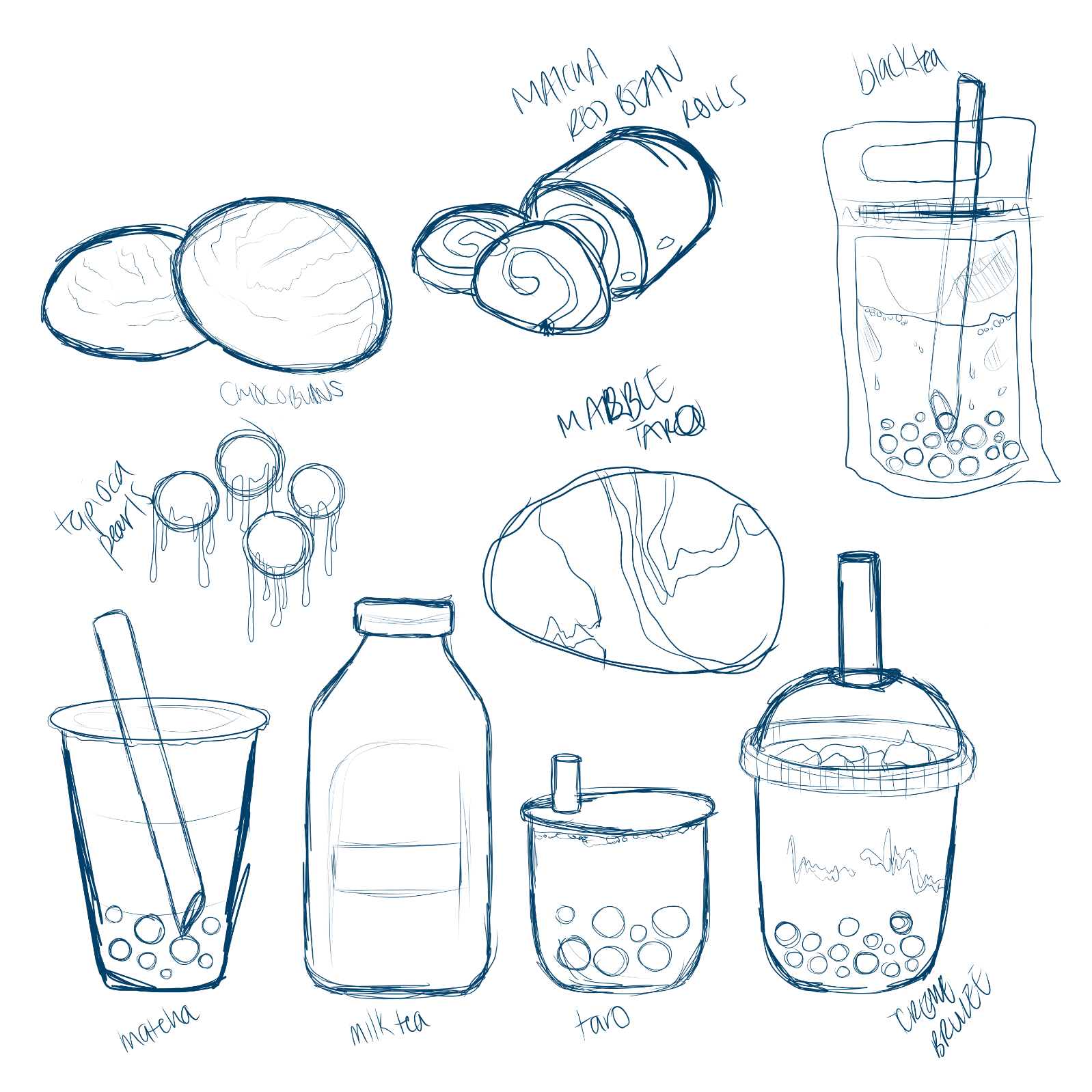
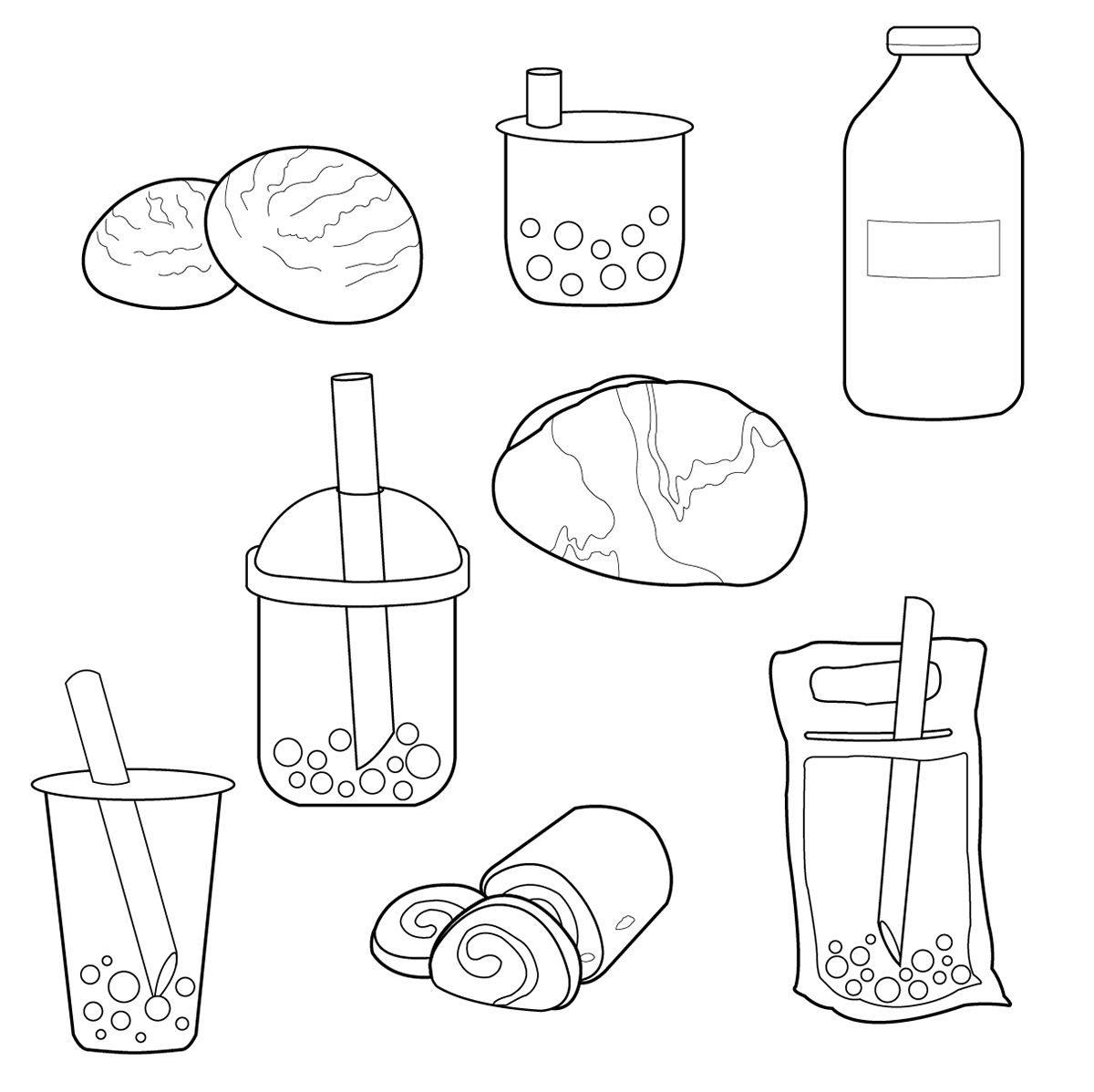
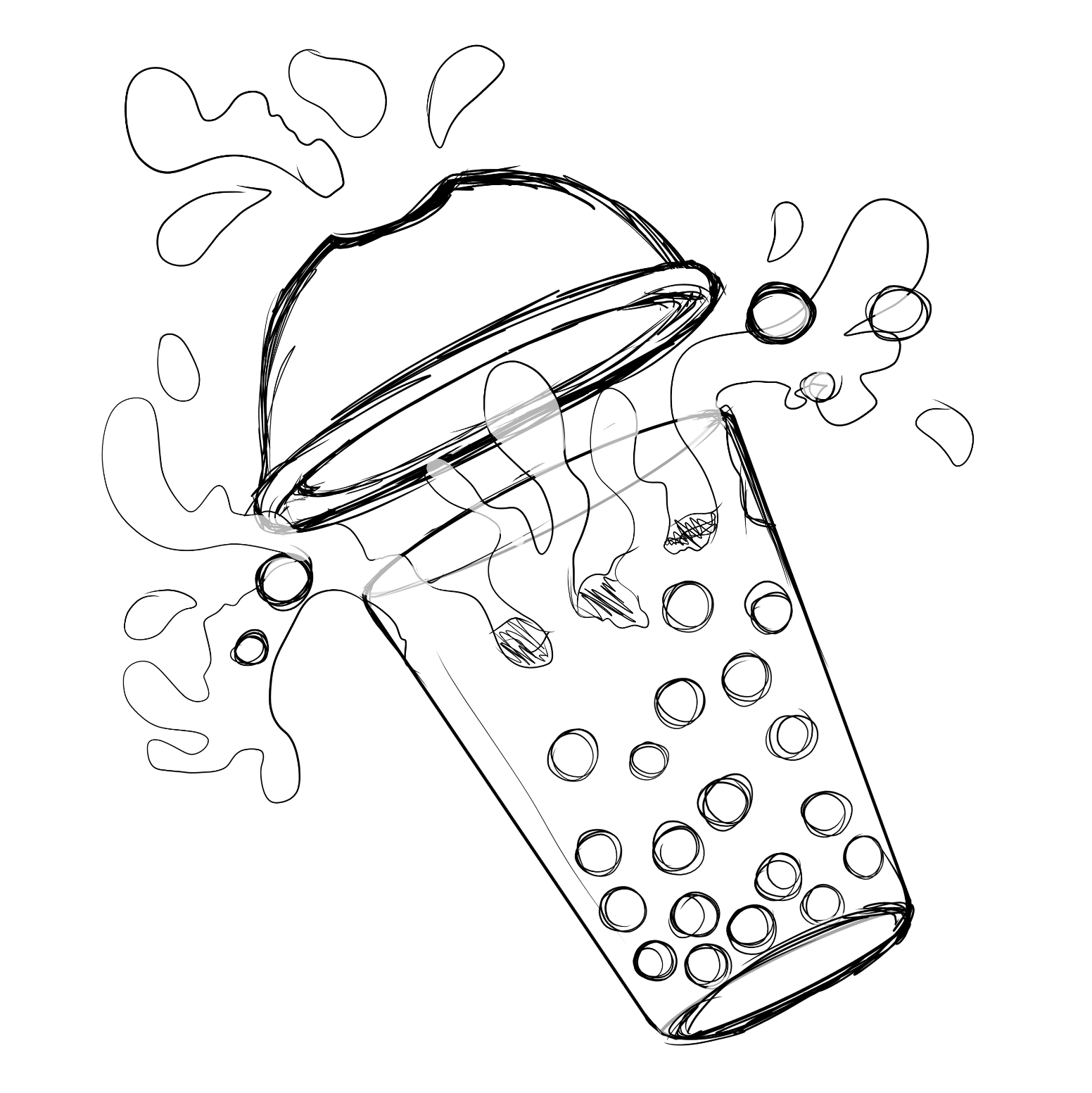
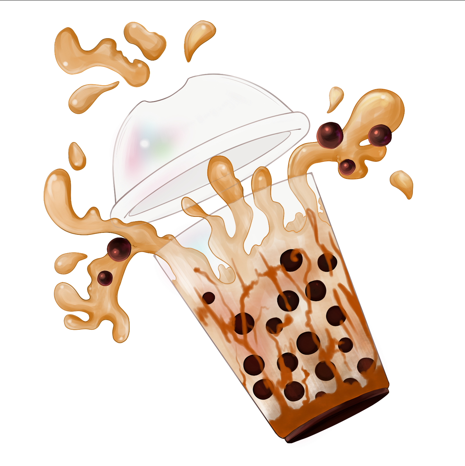
The icons I included in the app were boba drinks a long with pastries you commonly find in boba shops. I sketched up some milk teas, marble taro bread, choco-buns, and matcha red bean rolls.
Final Prototype
Mockups
